The Trademark consists of the symbol and the name (University for Foreigners of Perugia). The relationship between these two elements is governed by precise geometric proportions and cannot be altered under any circumstances. From this original core, a paradigm extends that conveys history, tradition, and values both internally and externally. It reflects two fundamental functions: distinctive and representative.

Basic version (black and white)
Versions
The symbol and logotype (the name), typeset in the ITC Bodoni Seventytwo font, are combined in two distinct configurations that define the trademark versions. Versions (1,2) can be used depending on the cases illustrated below, with each constituting the graphic reference standard. The relationship between the two elements of the trademark cannot be altered in either version.
Version 1

Version 2

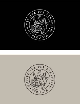
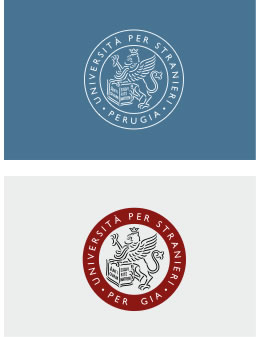
Color versions
The use of color in the trademark is permitted as shown in the examples below. The color version of the trademark can be used as an alternative to the basic version (black and white). For institutional communications, sponsorships, and all advertising and promotional contexts, the “neutral” color and the “foreigners red” can be used according to the prevailing color scheme.
Version 1
The symbol and logotype are reproduced in PMS 403 C and black
Color version 1

Version 2
The symbol and logotype are reproduced in PMS 188 U and black
Color version 2

Using only the symbol
The symbol (griffin) makes the University’s trademark particularly distinctive and evocative. Exclusive use of the symbol on surfaces (paper, leather, synthetics) is allowed where readability conditions are minimal, or when the name “University for Foreigners of Perugia” is consistently present in written communications. Its exclusive use may extend to communications and printed materials indicated in this manual. It may also be adopted as a seal through dry-stamping.

Clear space around the trademark
Any text or graphic element must be placed outside a predetermined area surrounding the trademark. The trademark’s readability increases if the adjacent area is sufficiently wide.

Trademark readability
Minimum reproducible size
A reproduction size limit is defined for all versions of the symbol and the trademark to ensure readability.
The symbol can be reduced to a base of 12 mm

The trademark down to a base of 20 mm
Use of color and the trademark

Incorrect use of the trademark

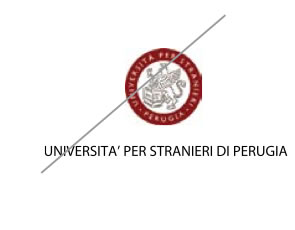
1. Do not alter the proportions of the trademark; do not change its configuration or typeface

2. Do not use background colors that compromise the readability of the trademark and other symbols

3. Do not change or alter the color of the trademark

4. Do not use photographic images that compromise the readability of the trademark