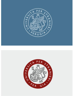
The Logo consists of the symbol and the name (University for Foreigners of Perugia). The relationship between the two elements is adjusted by precise geometric proportions and cannot be altered in any case. This original symbol develops a paradigm trasmitting from within and from without, the University’s history, tradition and values. The Logo reflects two basic functions: distinctive and representative.

Basic version (black and white)
Versions
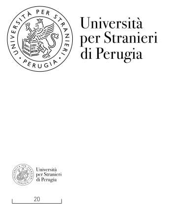
The symbol and the logotype (name), made with the ITC Bodoni typeface Seventytwo, are combined with each other by means of two distinct configurations that define versions of the Logo. The versions (1.2) can be employed as the case shown below, and each constitute the standard reference chart. The relationship between the two elements of the logo, in two distinct versions, can not be altered.
Version 1

Version 2

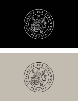
Color versions
The use of color in the logo is expected in the following cases. The color can be used as an alternative to the basic version (black and white). For institutional communication, for sponsorship and for advertising and promotion the color "neutral" and the color "red foreigners" can be used idepending on the chromatic contexts of reference.
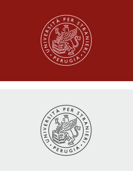
Version 1
The symbol and the logo are reproduced in color PMS 403 C and black
Color version 1

Version 2
The symbol and the logo are reproduced in color PMS 188 U and black
Color version 2

Use only the symbol
The symbol (Griffin) is a logotype particularly distinctive and evocative. The 'exclusive use of the symbol on surfaces (paper, leather, synthetic) should be in a position to minimum readability or when the name "University for Foreigners of Perugia" is constantly present in a written communication. Its exclusive use may extend to communications and to printed versions mentioned herein. Also it can be adopted as a seal by punching dry.

Area neutral brand
Any text or graphics is to be placed outside of a predetermined area containing the Logo. The legibility of the brand is enhanced if the area is large enough.

Legibility of the Logo
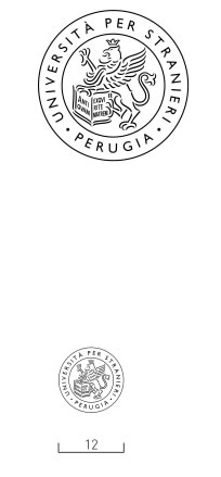
Minimum size reproduction
For all versions of the symbol and the brand it is defined as a limit of reproduction in order to ensure readability.
The symbol can be reduced up to a base of 12 mm
The mark up to a base of 20 mm
Using color and brand
Incorrect use of the mark

1. Do not alter the proportions of the mark; not to change configuration and typeface

2. Do not use background colors that would impair the readability of the logo and other signs

3. Do not change or alter the color of the brand

4. Do not use photographic images that would impair the readability of the logo